Brasserie de la Place
Burgundy, cream and gold connect the menu, stationery and restaurant identity mockups.
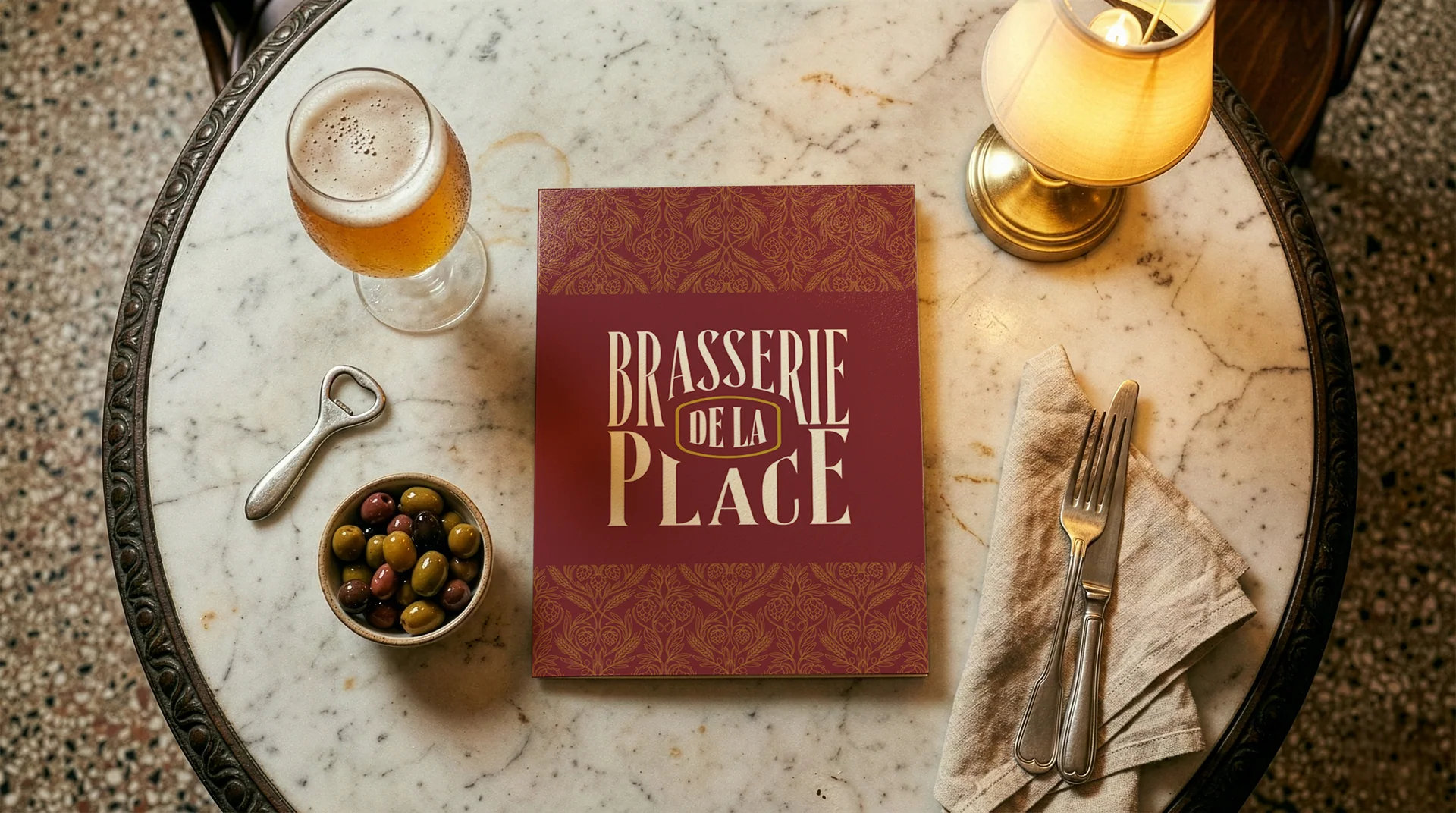
A place at the table.
An identity throughout.
A condensed wordmark, decorative pattern and circular emblem give Brasserie de la Place a shared visual language. Burgundy, cream, muted green and gold carry the system from menus to the restaurant-facing applications.
Project details
- Project type
- Restaurant identity and menu design.
- Discipline
- Brand identity
- Scope
- Visual identity
- Menu design
- Stationery
- Signage and apparel mockups
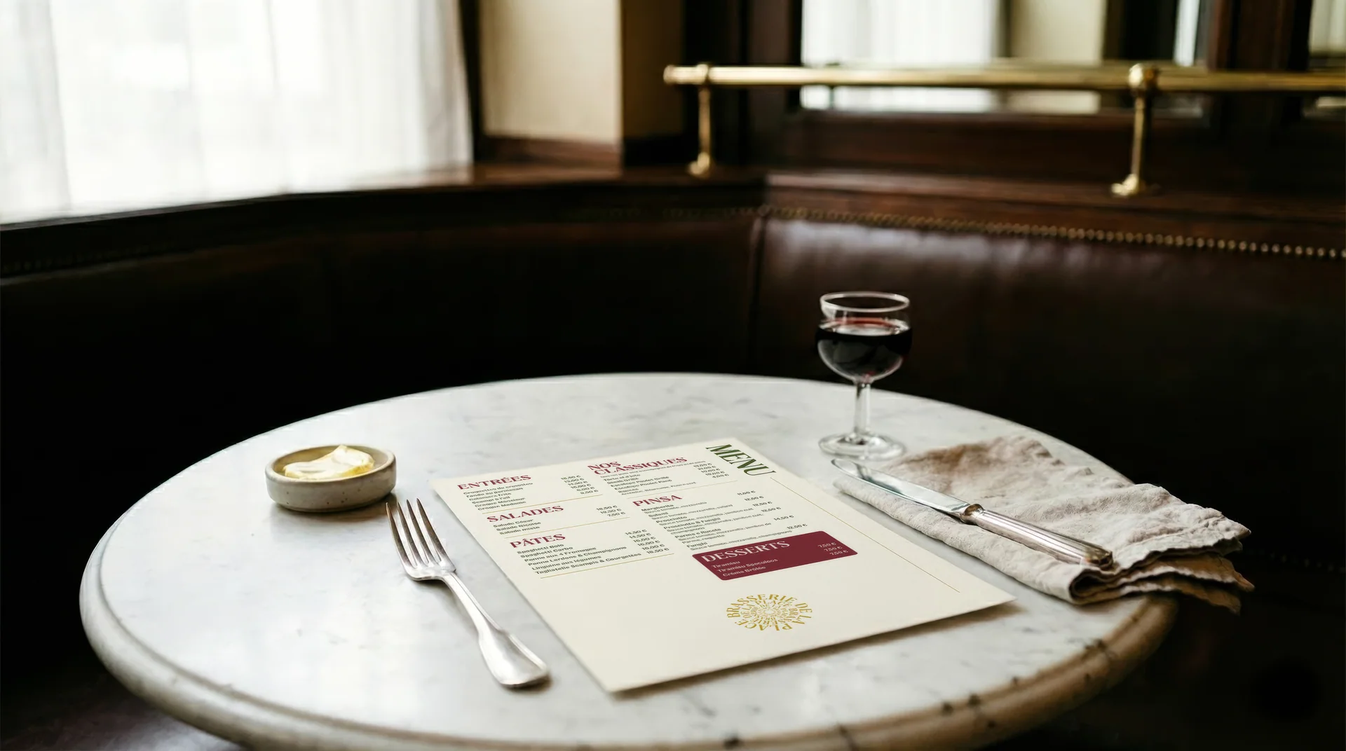
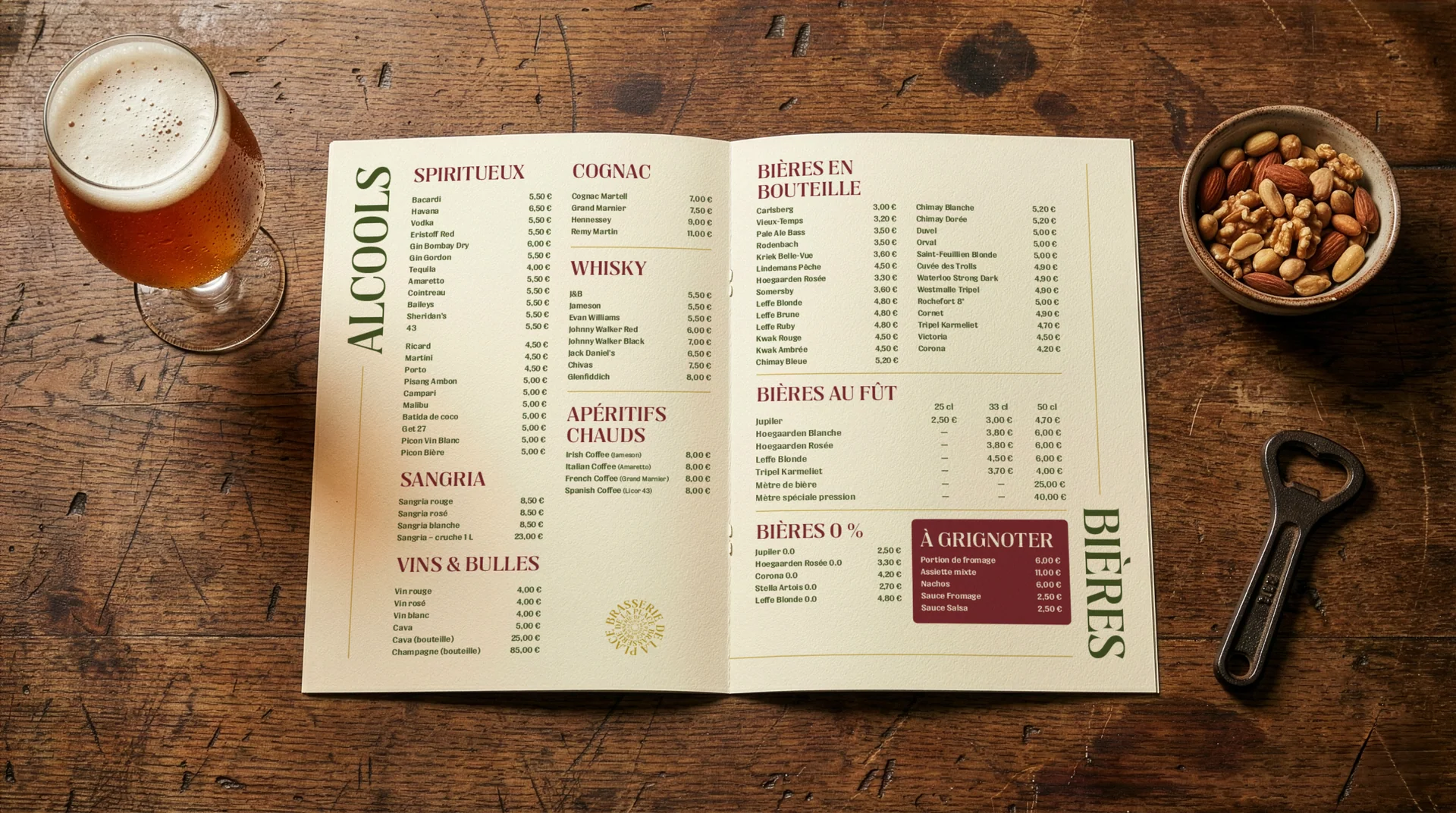
A clear rhythm for food and drink.
The main menu and drinks list use category headings, grouped listings and restrained burgundy panels to organise the content. Muted green gives the large labels their own hierarchy.
A signature that carries through.
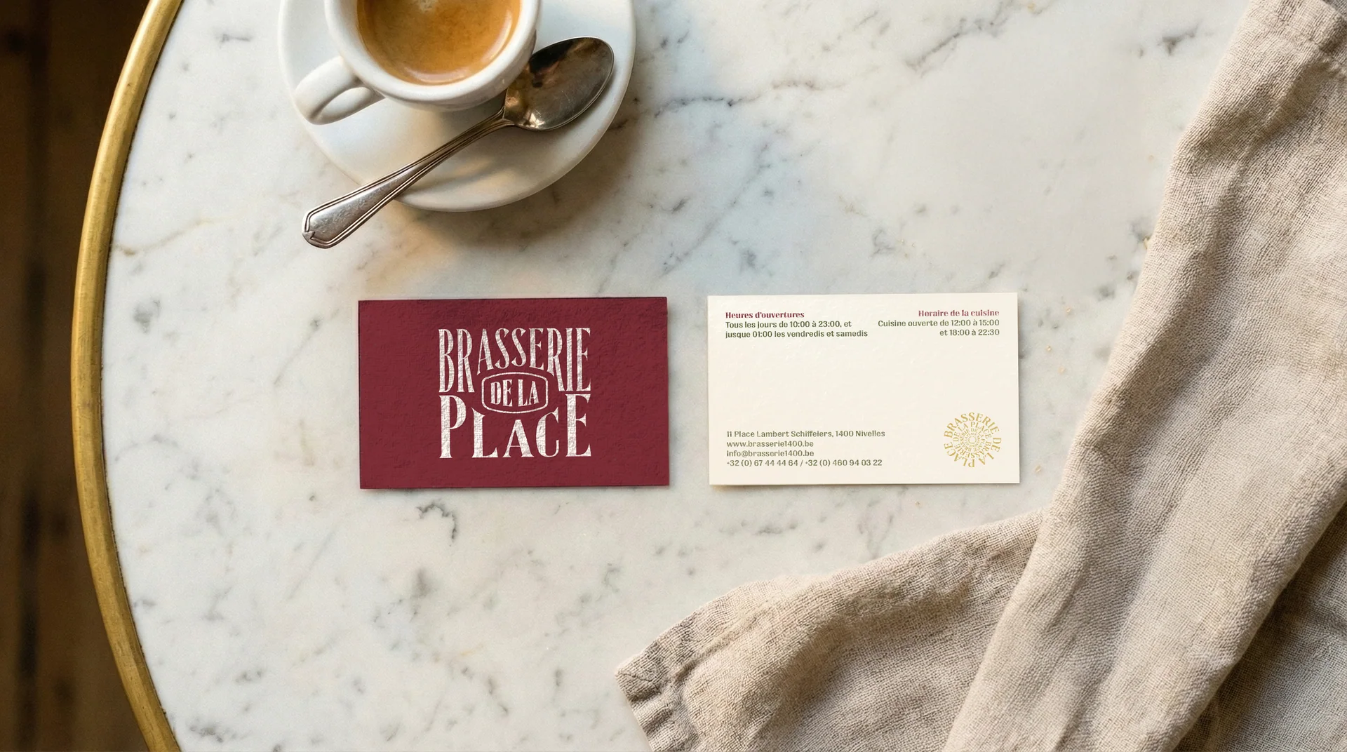
Burgundy and cream business cards pair the condensed wordmark with a circular gold emblem. The same palette connects the stationery to the menu cover.
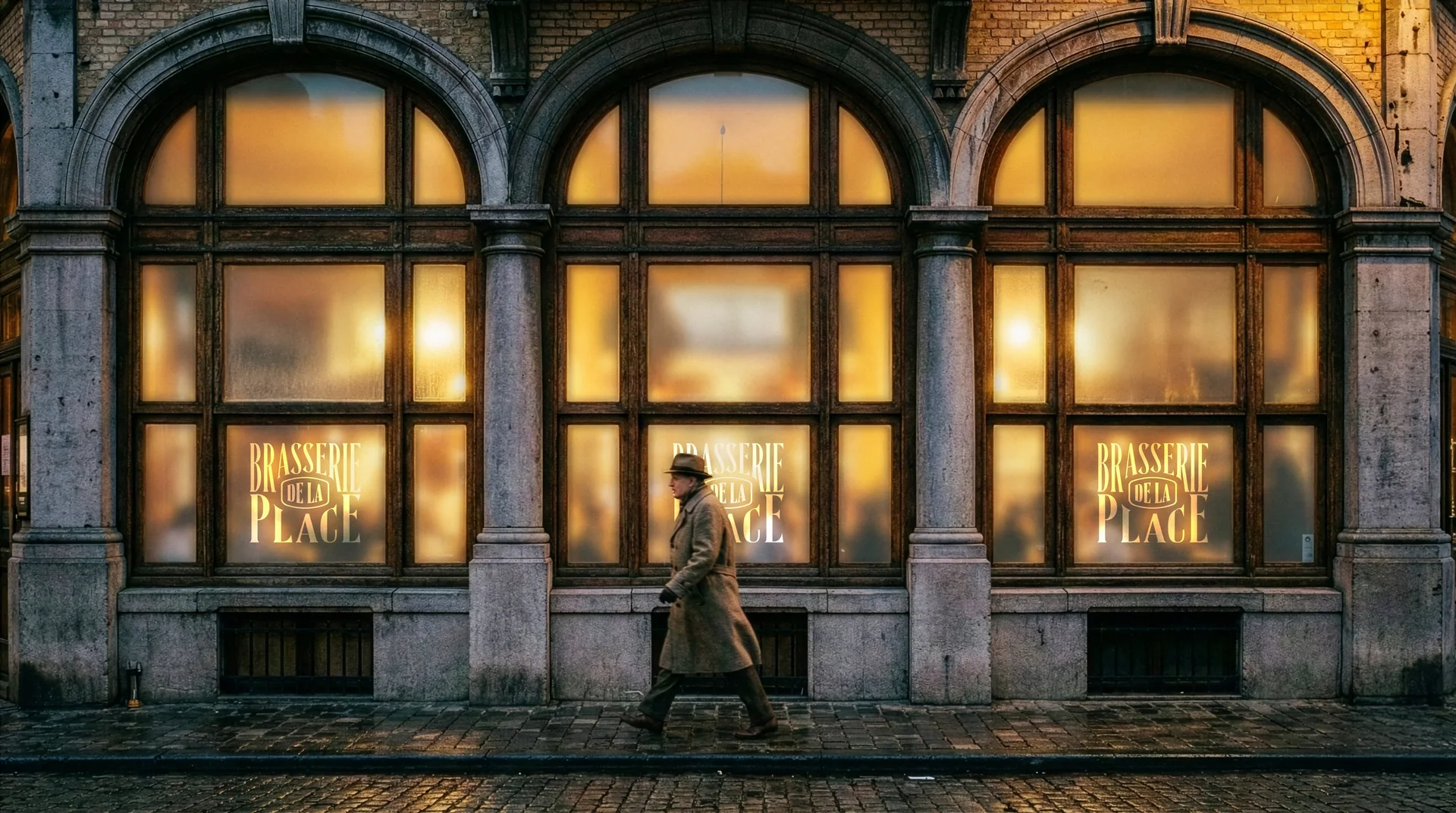
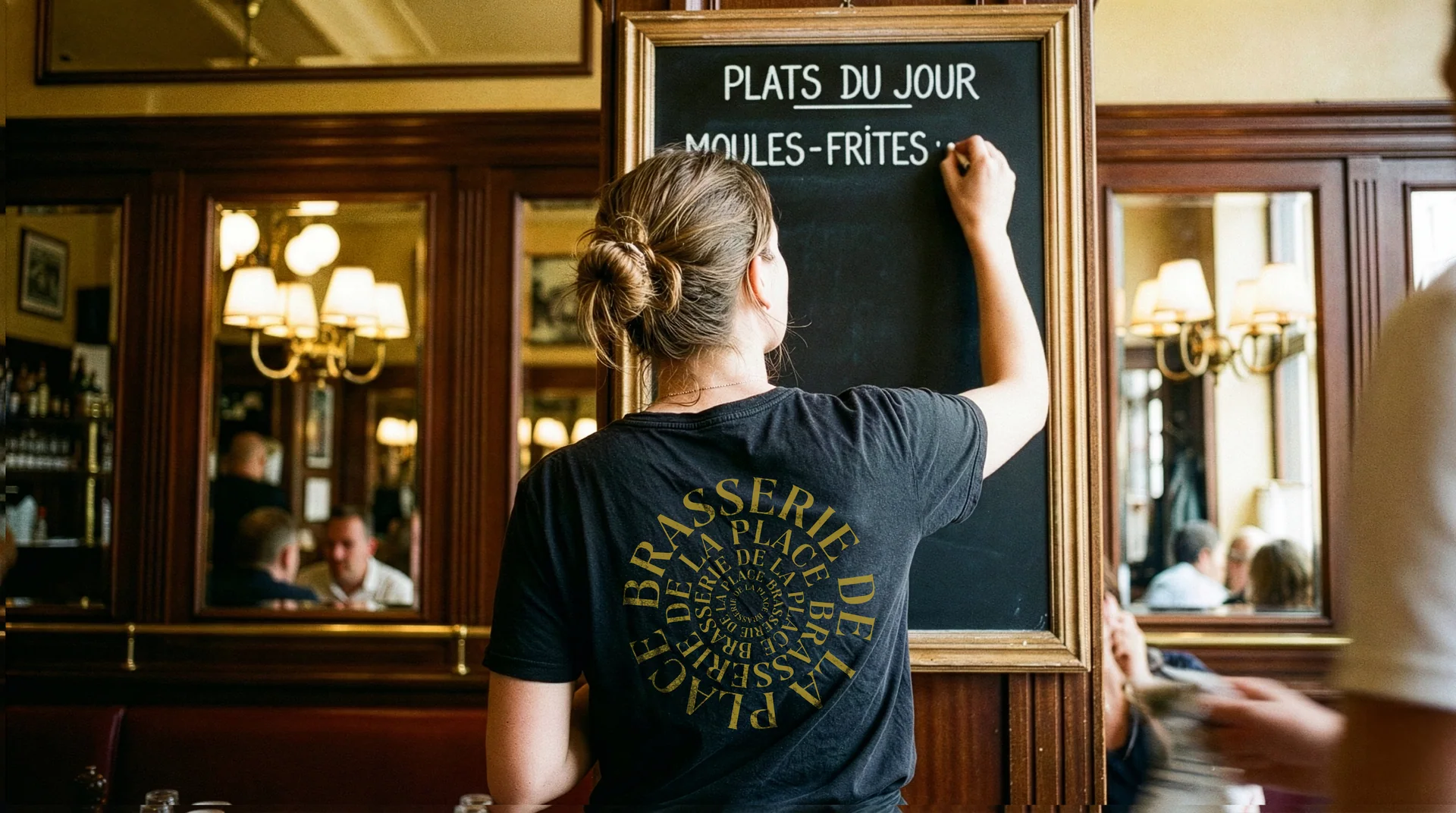
From the front window to the team.
Gold window lettering extends the identity across the arched storefront. A circular arrangement of the name and emblem appears on a black staff T-shirt. These supplied scenes are design mockups; they do not establish installation or production.