Cura Suites
A calm visual identity with an expressive serif wordmark, warm neutrals and a flexible C emblem.
A calm presence.
A considered system.
An expressive CURA wordmark pairs with a circular C emblem and a warm neutral palette. The guidelines connect the identity across stationery and social-media concepts, supported by an interior mood direction.
Project details
- Project type
- Brand identity and guidelines.
- Discipline
- Brand identity
- Scope
- Logo system
- Colour and typography
- Brand guidelines
- Stationery and social concepts
- Year
- 2026
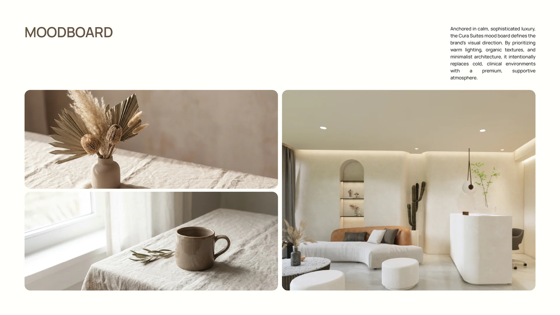
Warmth before ornament.
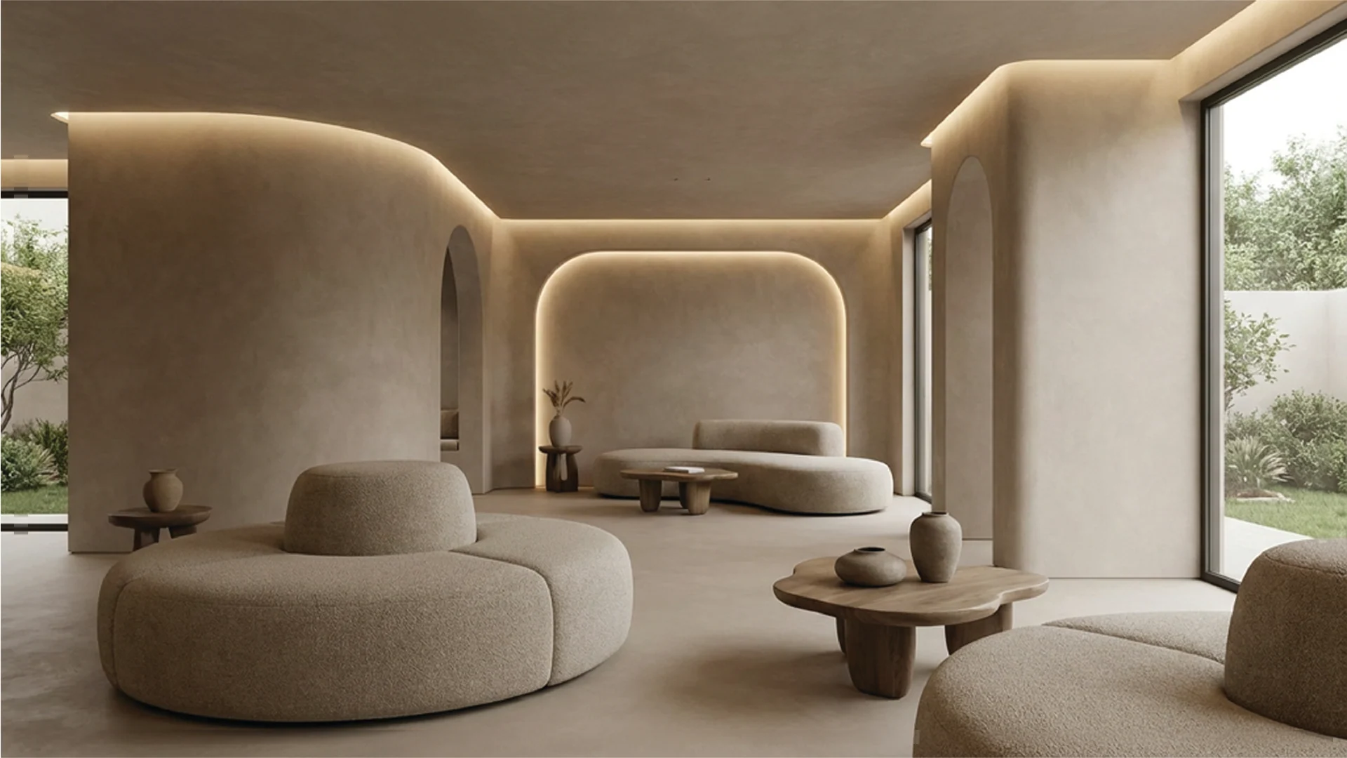
Soft lighting, curved interiors and organic textures establish the visual mood. These images are part of the supplied brand presentation and moodboard; the case study does not claim interior-design or construction delivery.
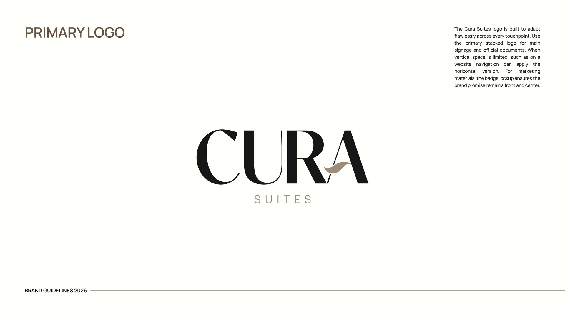
A wordmark and a quieter signature.
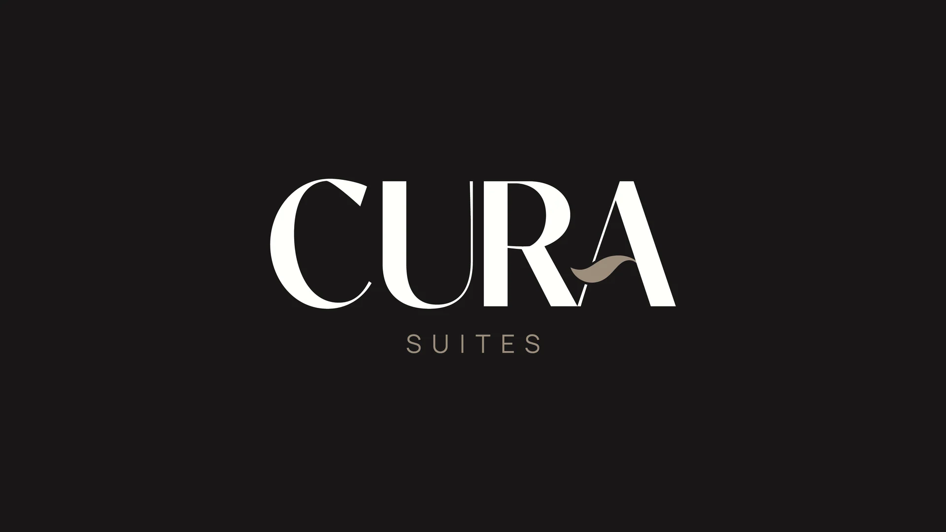
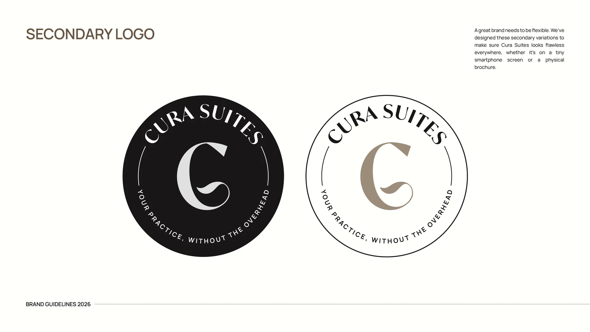
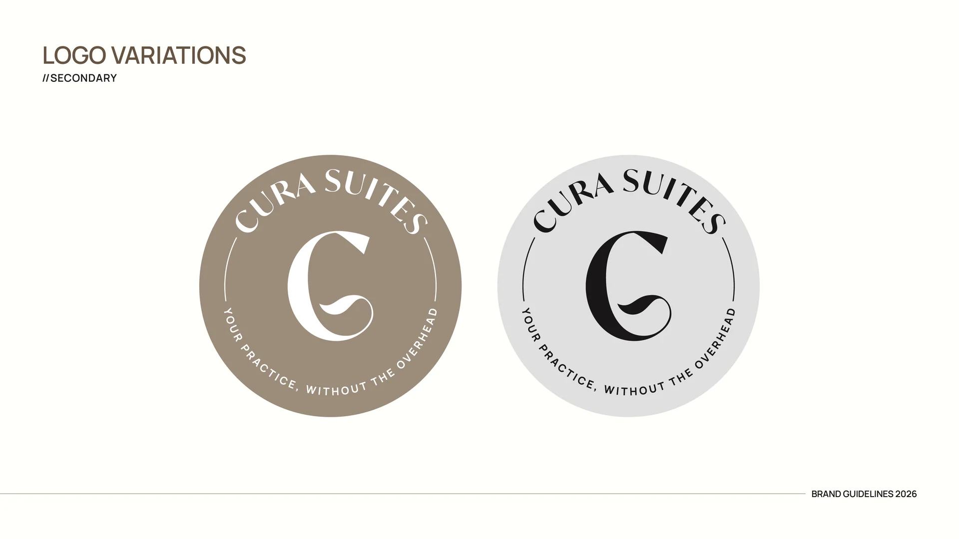
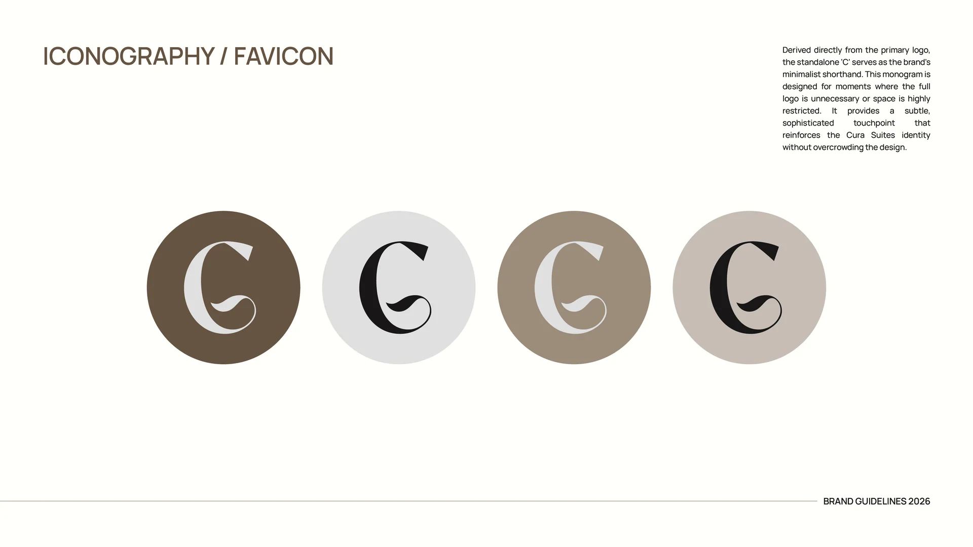
The primary wordmark uses contrasting serif strokes and a soft accent across the A. A circular C badge carries the name and the line “Your practice, without the overhead.” Alternate lockups keep the identity flexible across formats.
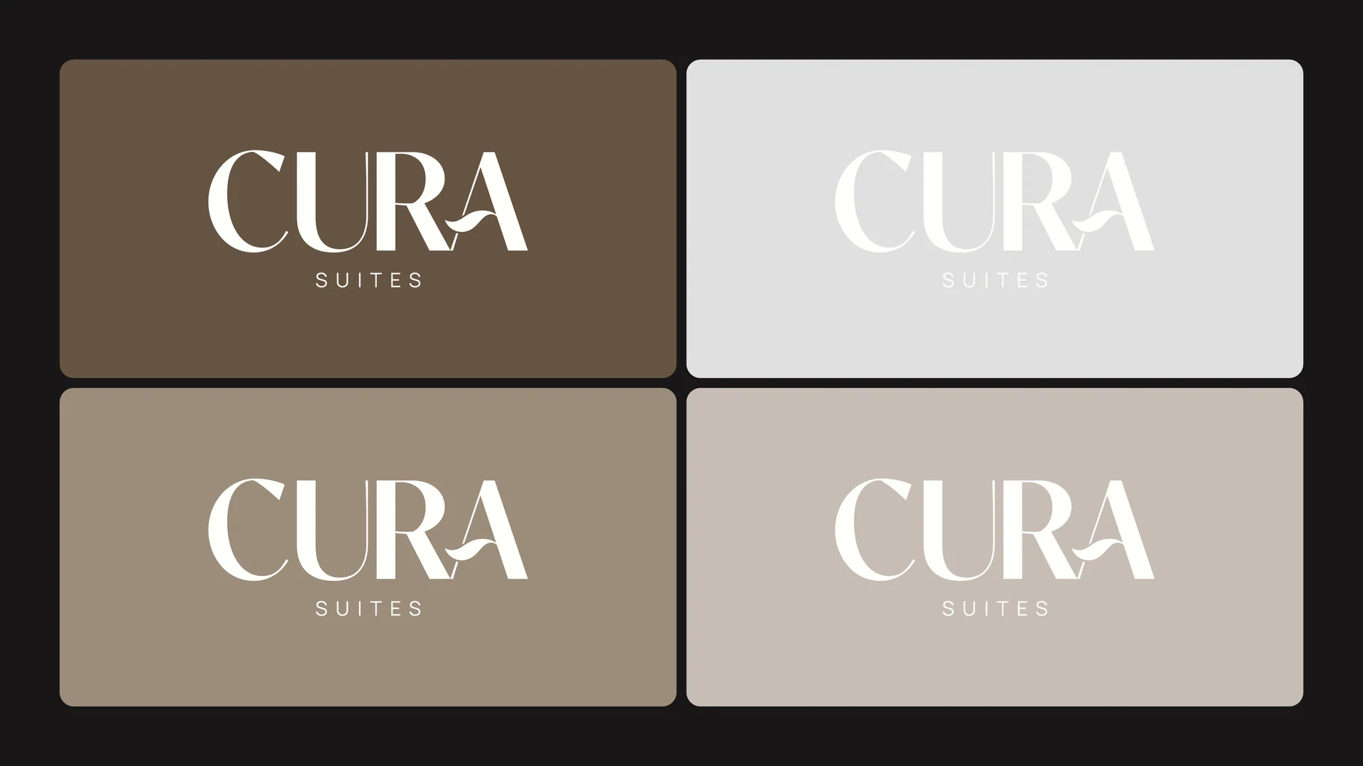
A grounded range of neutrals.
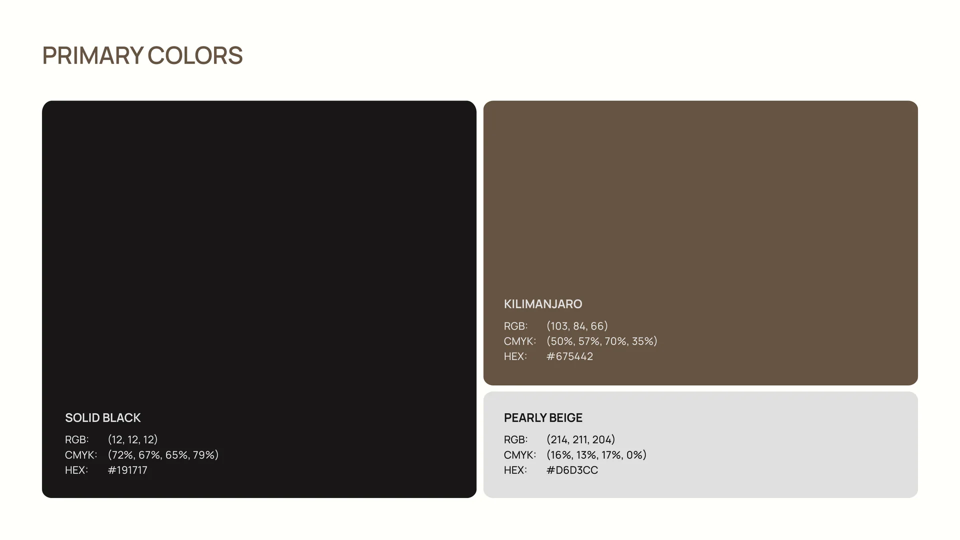
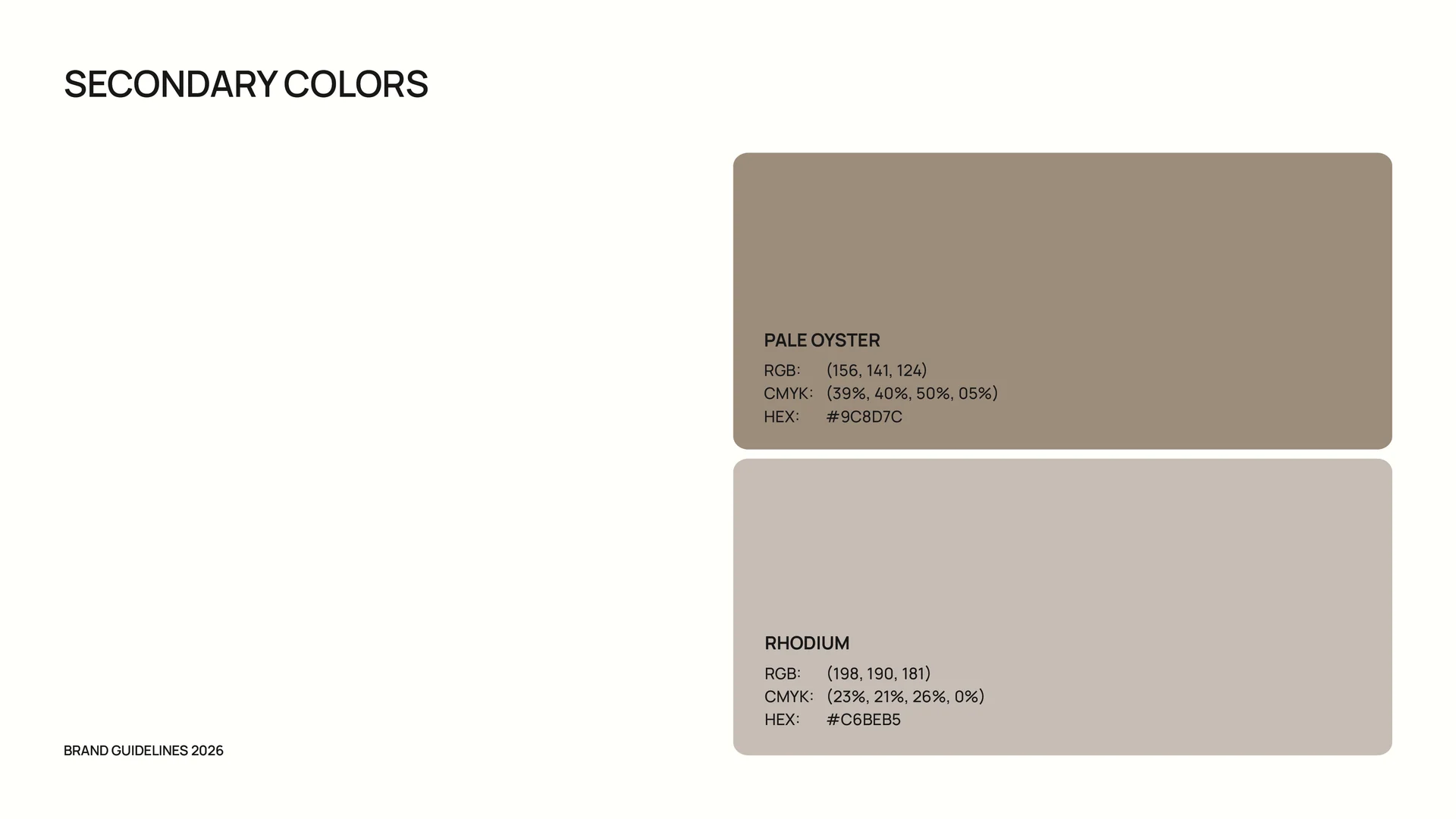
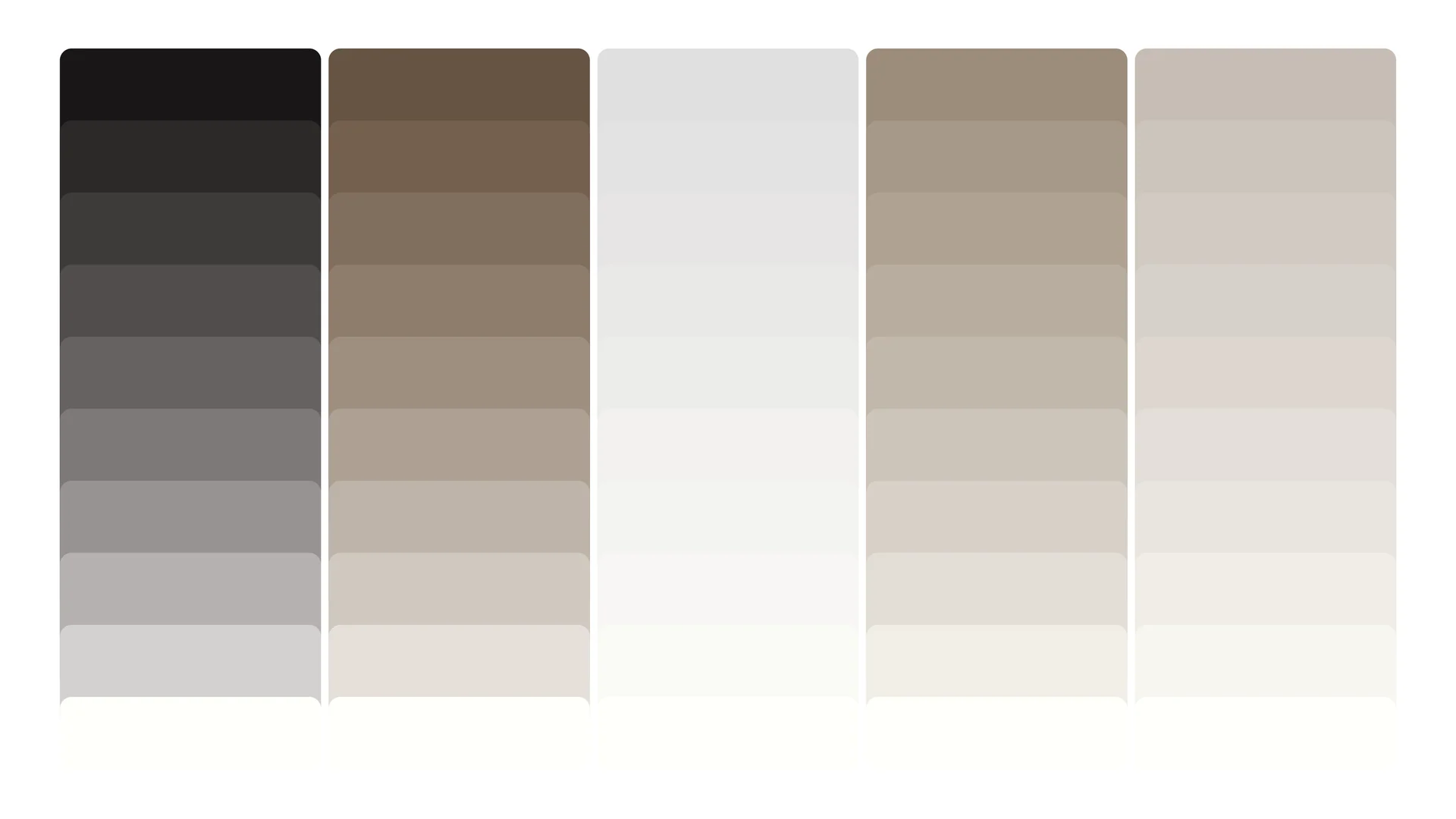
Near-black and warm brown anchor the palette. Pale neutrals carry the supporting colours, with tint scales documented for consistent application.
Character and clarity.
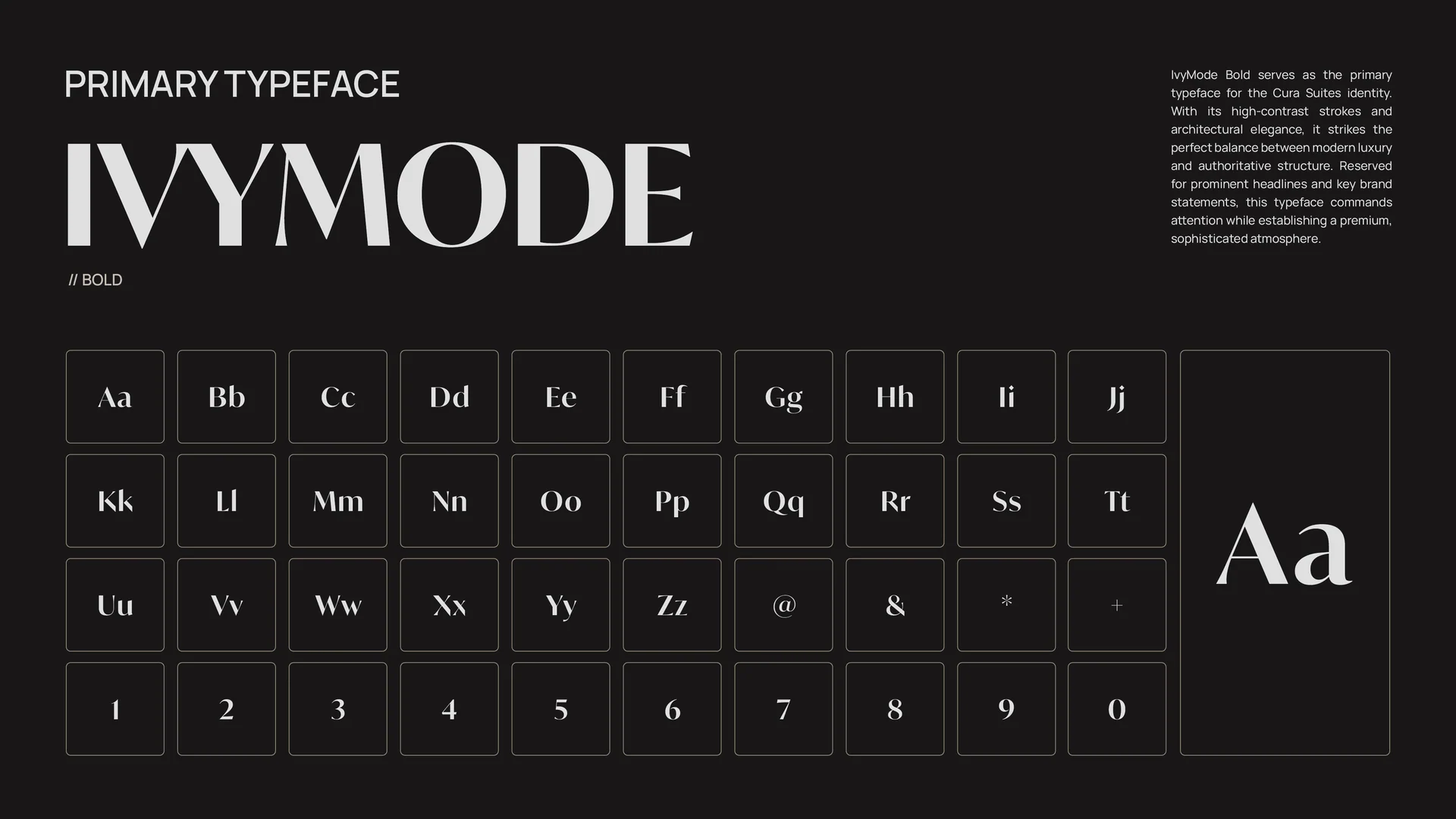
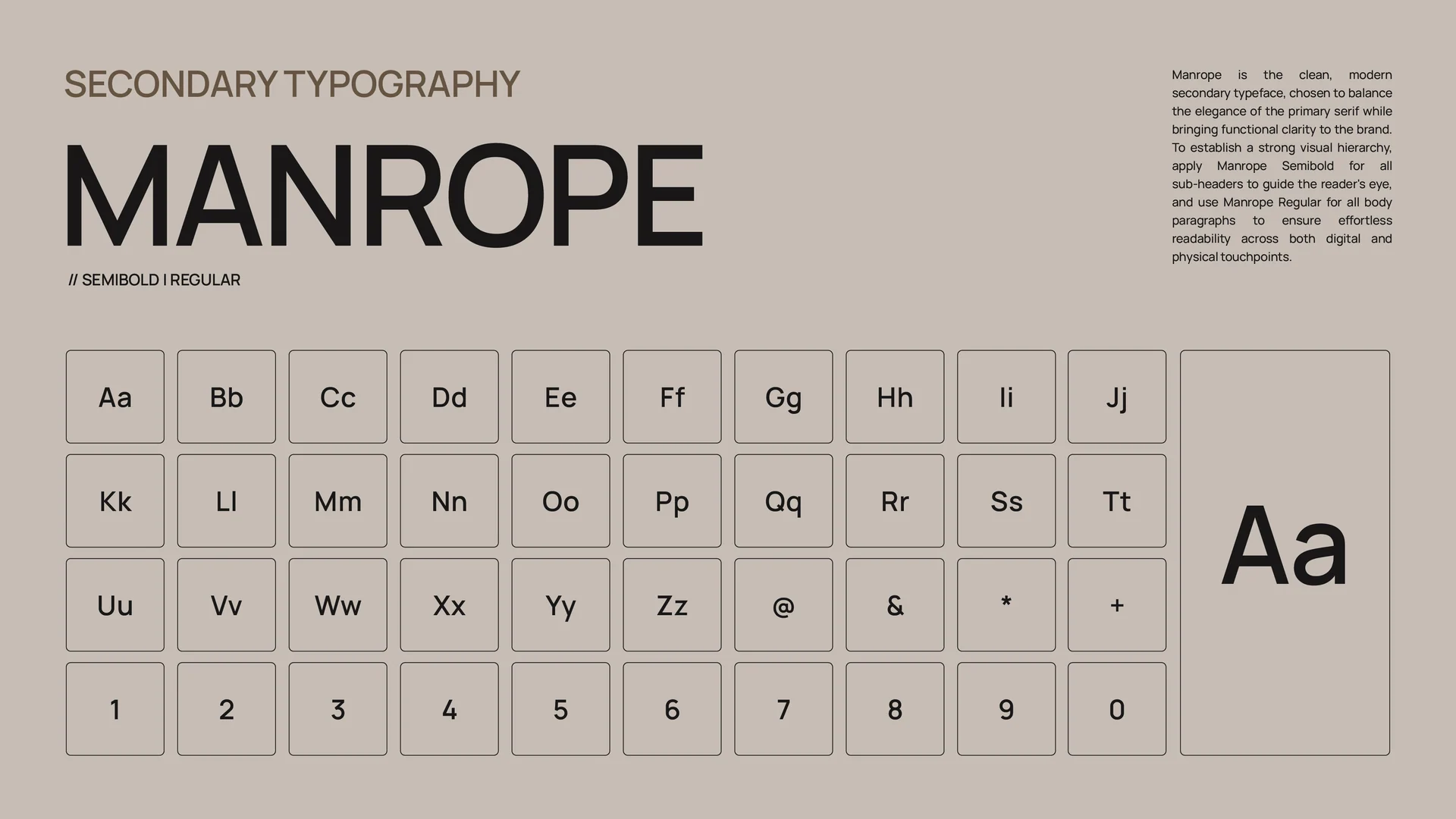
IvyMode Bold gives the identity its expressive display voice. Manrope provides the supporting typography, with full character specimens included in the guidelines.
Rules that keep the identity together.
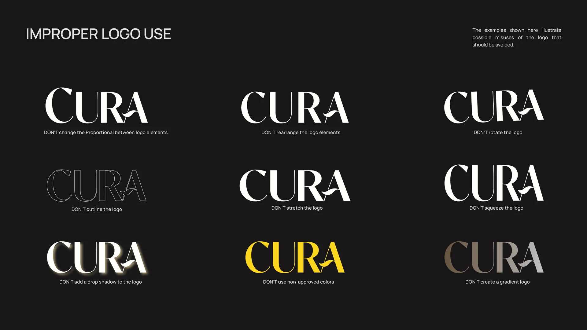
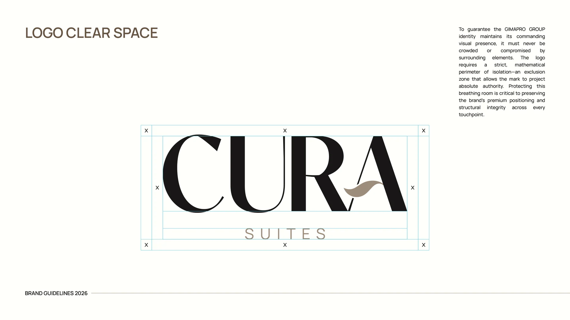
Logo-use examples, clear-space construction and icon variations give future applications a consistent starting point.
From stationery to the screen.
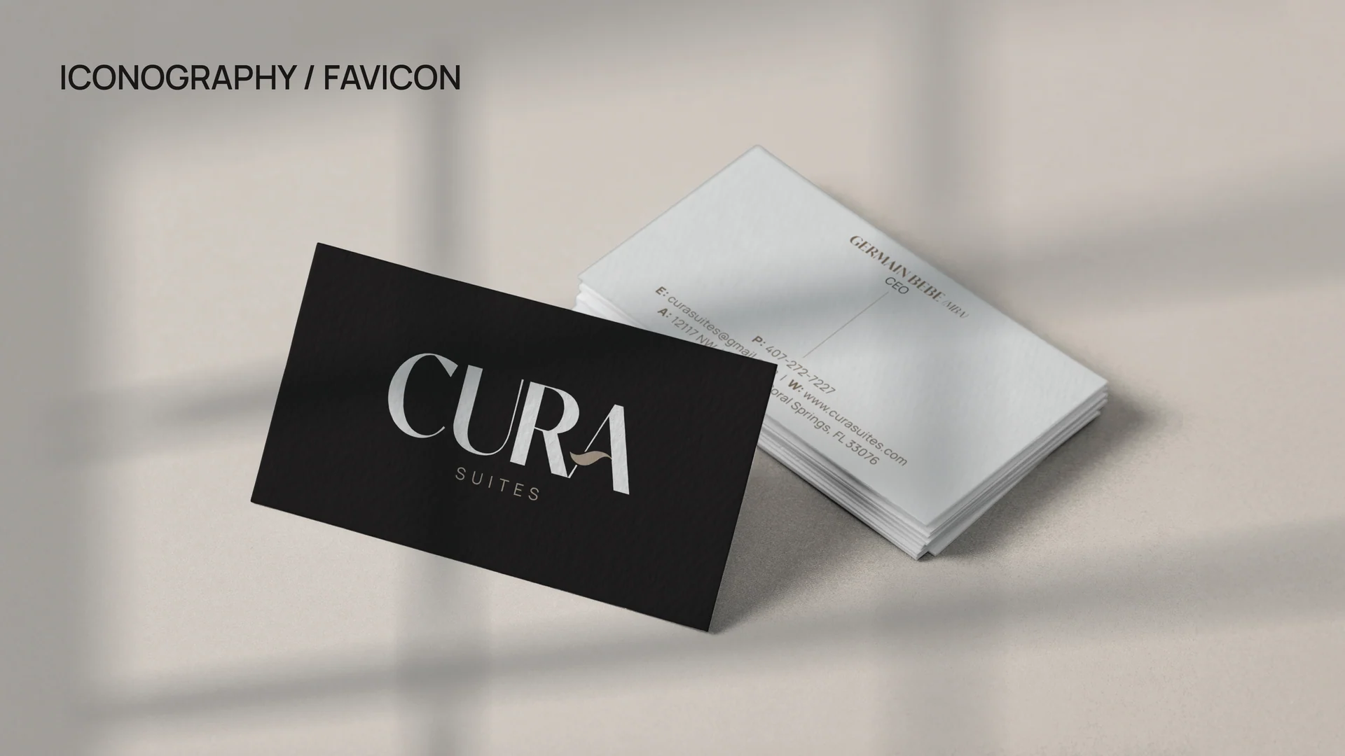
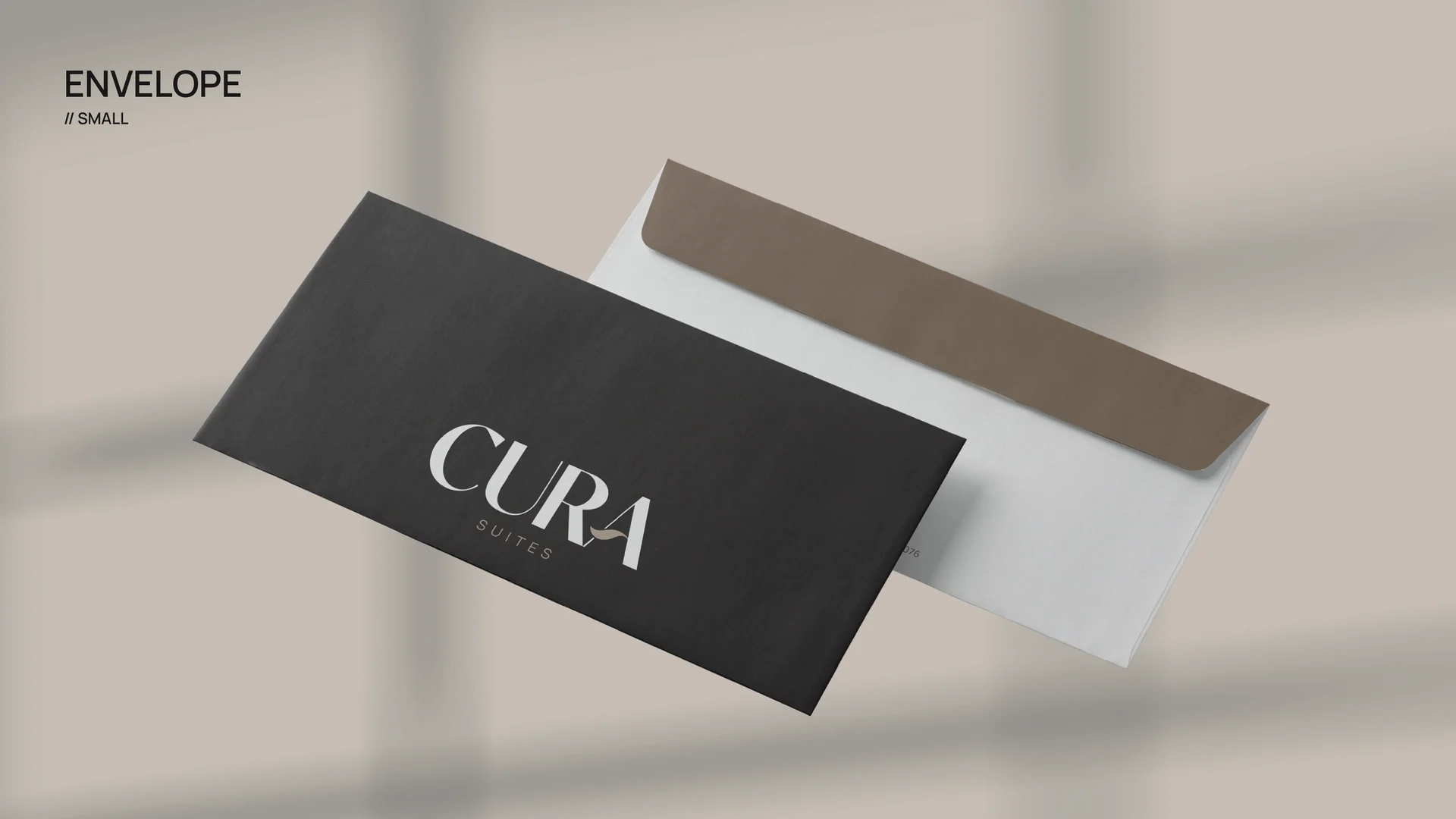
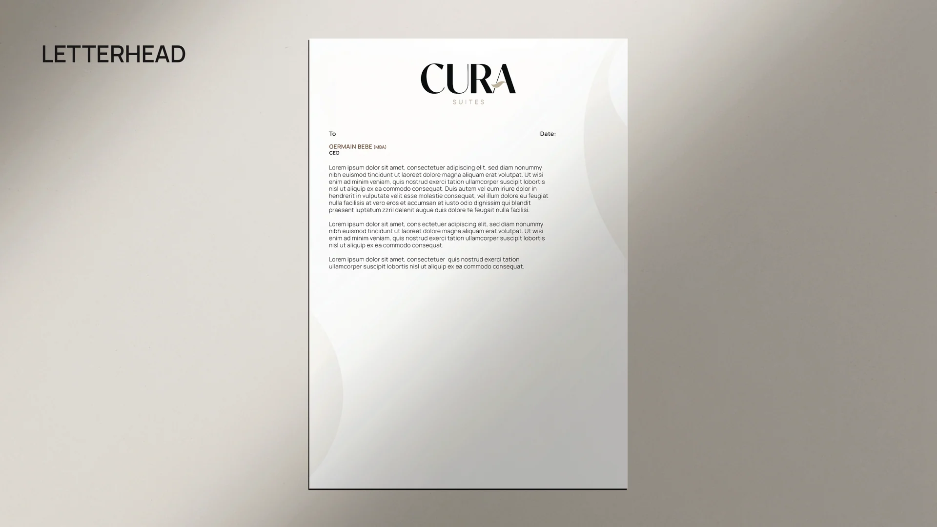
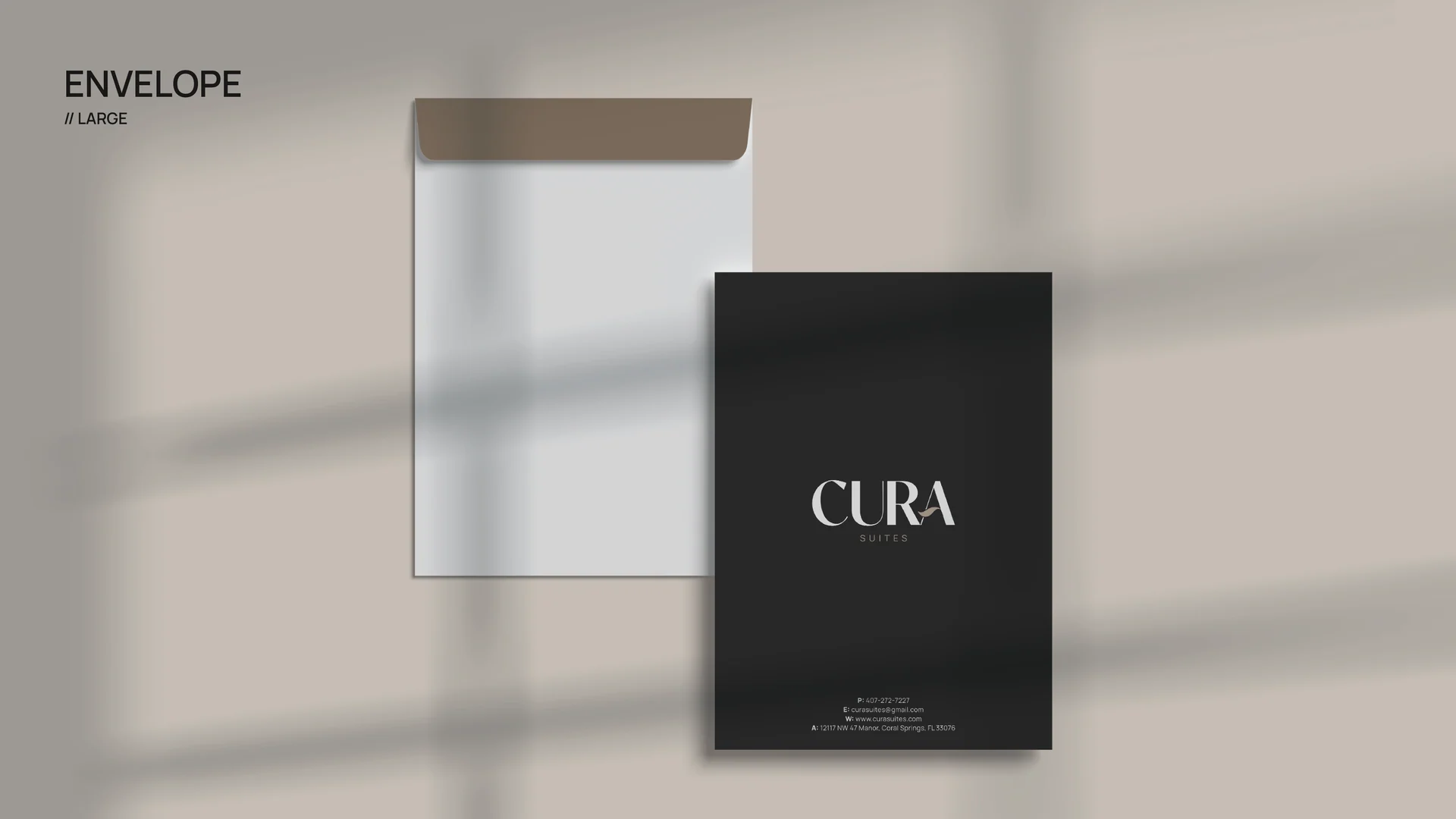
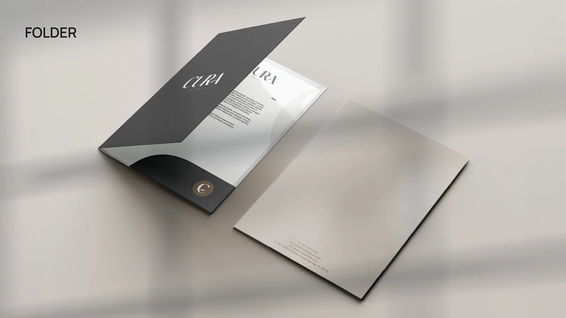
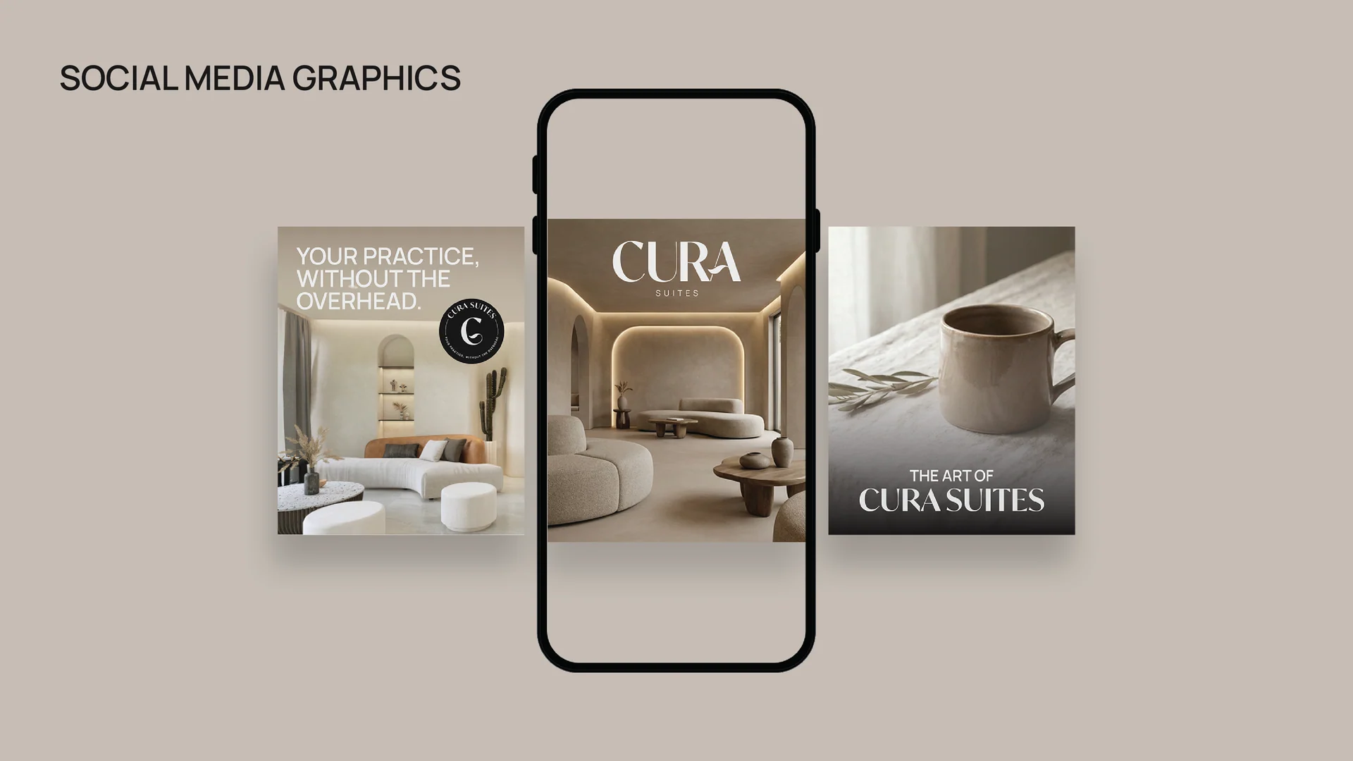
Business cards, envelopes, letterhead and a presentation folder extend the same palette and mark. The final board shows social-media concepts. These are supplied design mockups, rather than evidence of production or measured campaign results.