
Pompette
Blue lettering and orange accents for a place to drink, eat and groove.

Boire. Manger.
Groover.
The Pompette name moves from the street sign to menus, plates and olive bowls, keeping its playful rhythm throughout.
Project details
- Project type
- Brand identity.
- Discipline
- Brand identity
- Scope
- Visual identity
- Menus
- Signage
- Tableware
- Apparel
- Print collateral
Two underlines give the name a beat.
Orange underlines beneath the O and first E give the blue wordmark its rhythm. A zigzag adds movement to the hanging sign.


Read the menu. Finish the olives.
The menu carries the full name. A slanted P marks the plate; the olive bowl brings the wordmark back to the table.


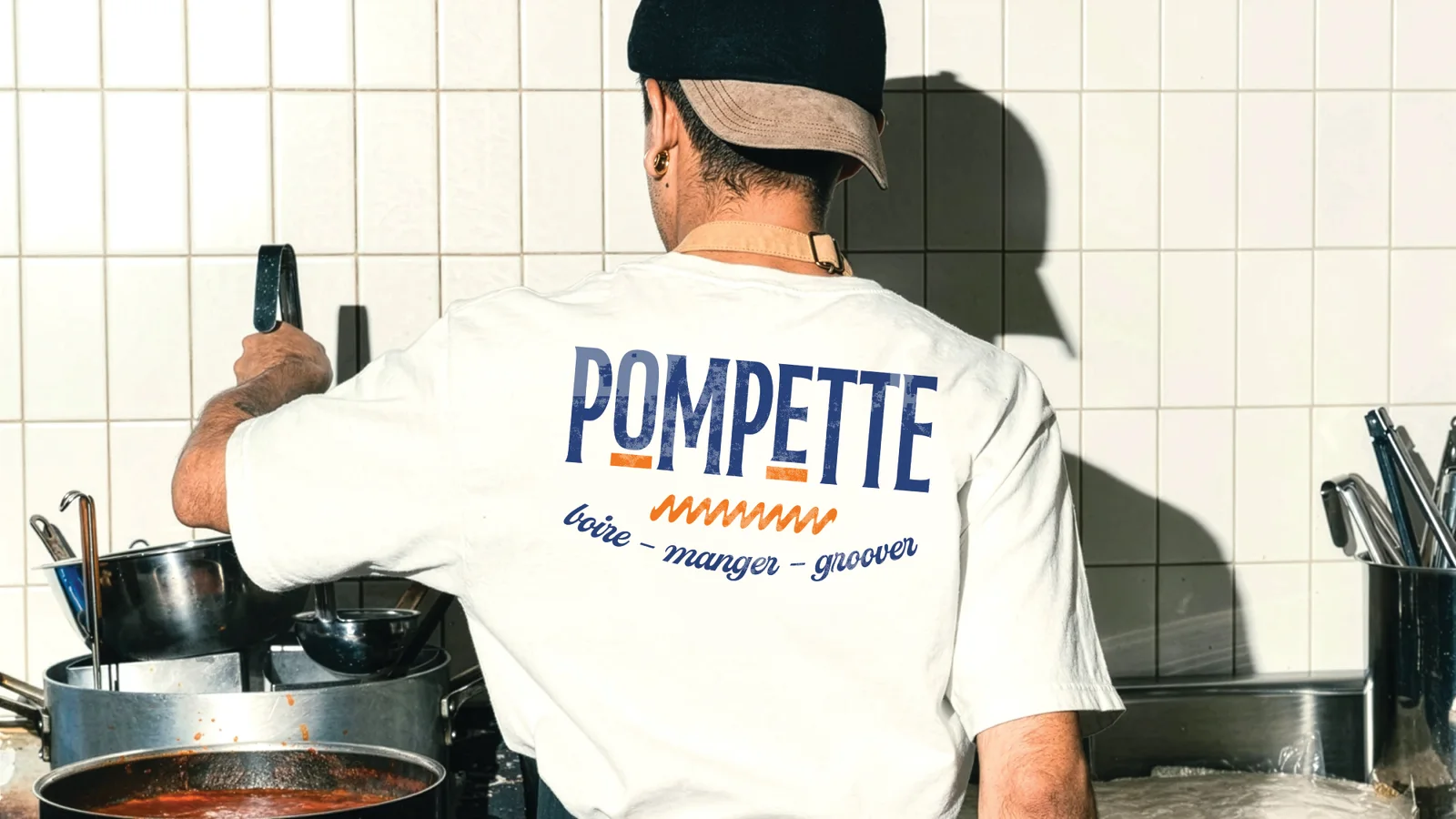
An identity you can wear.
Large lettering on shirt backs and smaller marks on chairs connect the kitchen, bar and dining room.


Something to take with you.
Cream lettering fills an orange tote. The P and zigzag recur on napkins, cards and posters.


