
Terravista
A geometric palm, expressive lettering and warm earth tones.

Above the city.
Beyond the ordinary.
Terravista’s palm becomes a logo, seal and pattern under the line “Above the city, beyond the ordinary.”
Project details
- Project type
- Brand identity.
- Discipline
- Brand identity
- Scope
- Logo system
- Color palette
- Typography
- Brand pattern
Curves meet geometry.
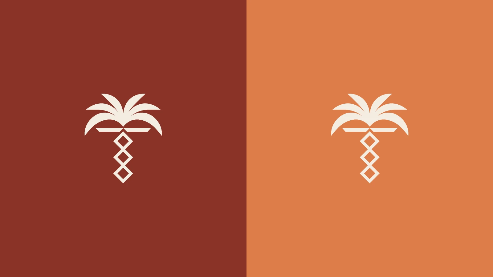
Curved fronds meet a trunk of stacked diamonds. The architectural silhouette holds its shape across light and dark backgrounds.

One identity. Multiple formats.
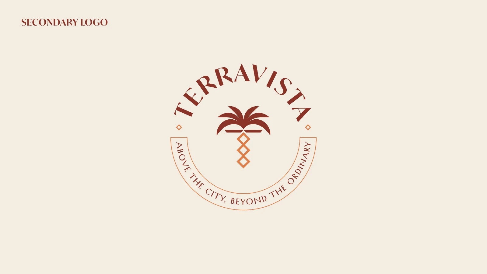
The primary logo, circular seal and standalone palm adapt the identity to different spaces and sizes.


Warmth, with definition.
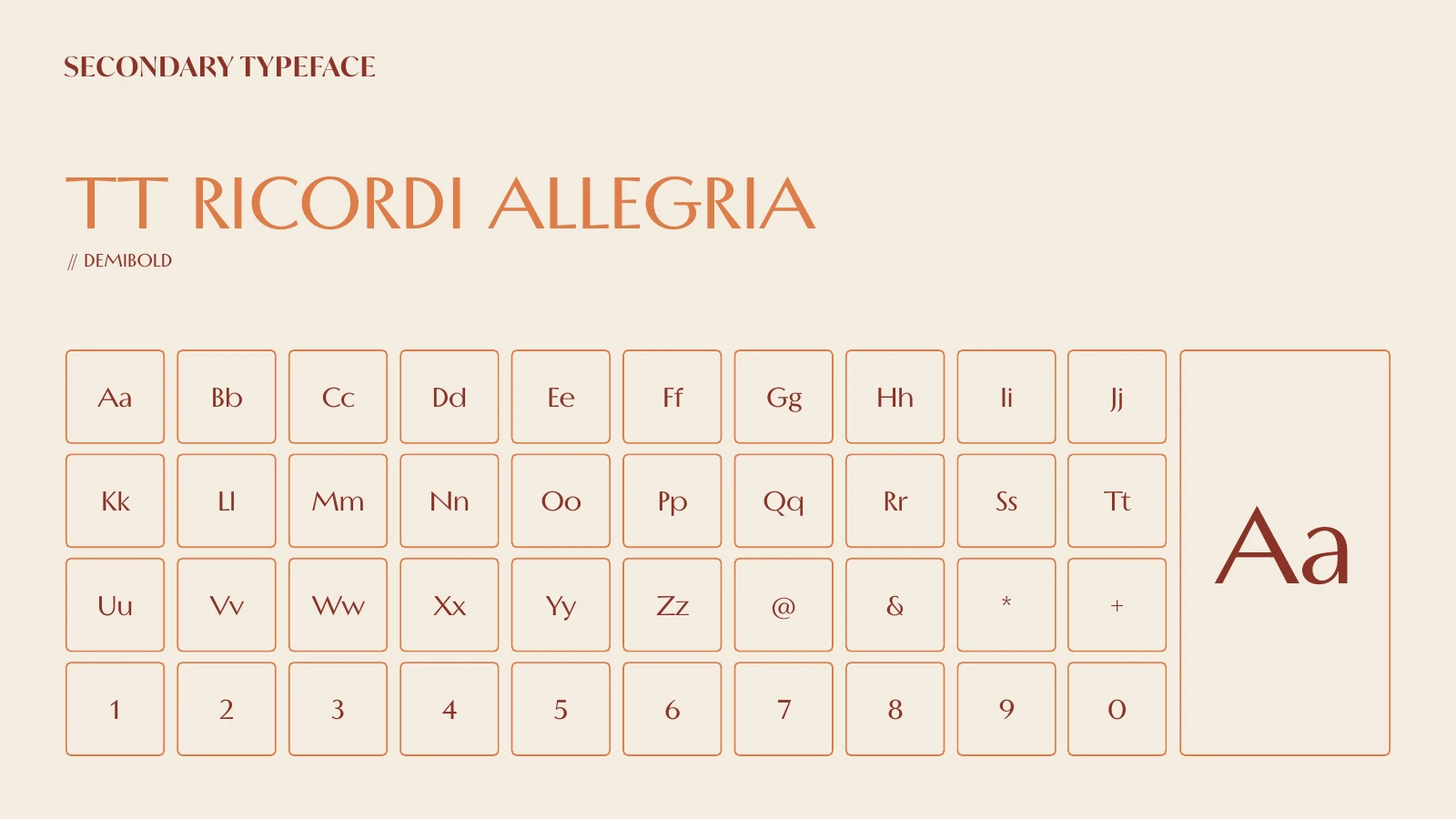
Red Brown (#8D3F2A), Pastel Copper (#DD8B5A) and Neutral Cream (#E9E2D7) set the palette. IvyMode Semibold pairs with TT Ricordi Allegria Demibold.


A mark worth repeating.
Repeating palms and diamonds turn the original emblem into a pattern in copper and red brown.
