
Branding / Practical guide
Restaurant logo ideas: 5 styles and how to choose
A restaurant logo needs to make sense on the things you actually use: the sign above the door, a takeaway bag and the menu on a phone. These five approaches will help you choose a direction and give your designer a clearer brief.
Start with the restaurant, then choose the style
Before collecting restaurant logo ideas, describe the place in a few sentences. What do you serve? Is the experience quick and informal, or built around a longer meal? Will most people find you on the street, through delivery or by recommendation? Those answers give a designer something more useful than a request to make it modern.
List the first things the identity needs to appear on. A restaurant launching with a single menu and printed bag has a different set of requirements from a business replacing illuminated signage across several locations. Include the existing sign dimensions, packaging samples and any artwork you need to keep.
A wordmark, emblem, mascot, symbol or monogram can each be a useful starting point. Choose two directions to explore, then compare them using the same materials.
Wordmark
Put a distinctive restaurant name first. Test the lettering at menu size.
Emblem
Bring name and detail into a badge. Simplify a second version for small uses.
Mascot
Give a playful concept a character. Check the personality fits the experience.
Symbol + name
Build a flexible pair for signs and small spaces. Keep the name legible.
Monogram
Use initials as a compact supporting mark. Introduce the full name alongside it.
DBS selection guide. Shortlist two directions, then test both on the same menu, sign and takeaway pack.
A wordmark that makes the name distinctive
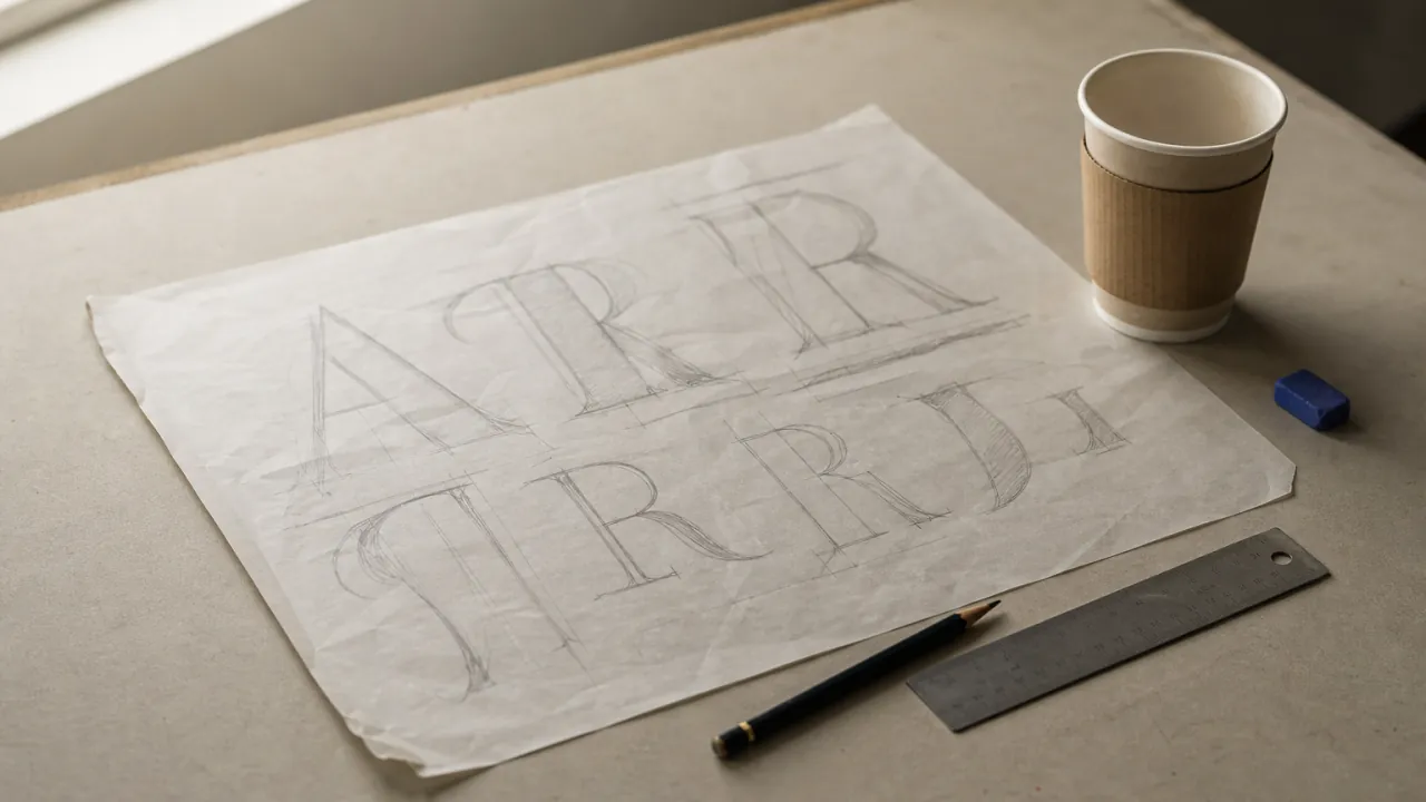
A wordmark uses the restaurant name as the main visual element. The character comes from the lettering: its proportions, spacing, shape and arrangement. It is worth exploring when the name itself is memorable and you want customers to read it quickly.
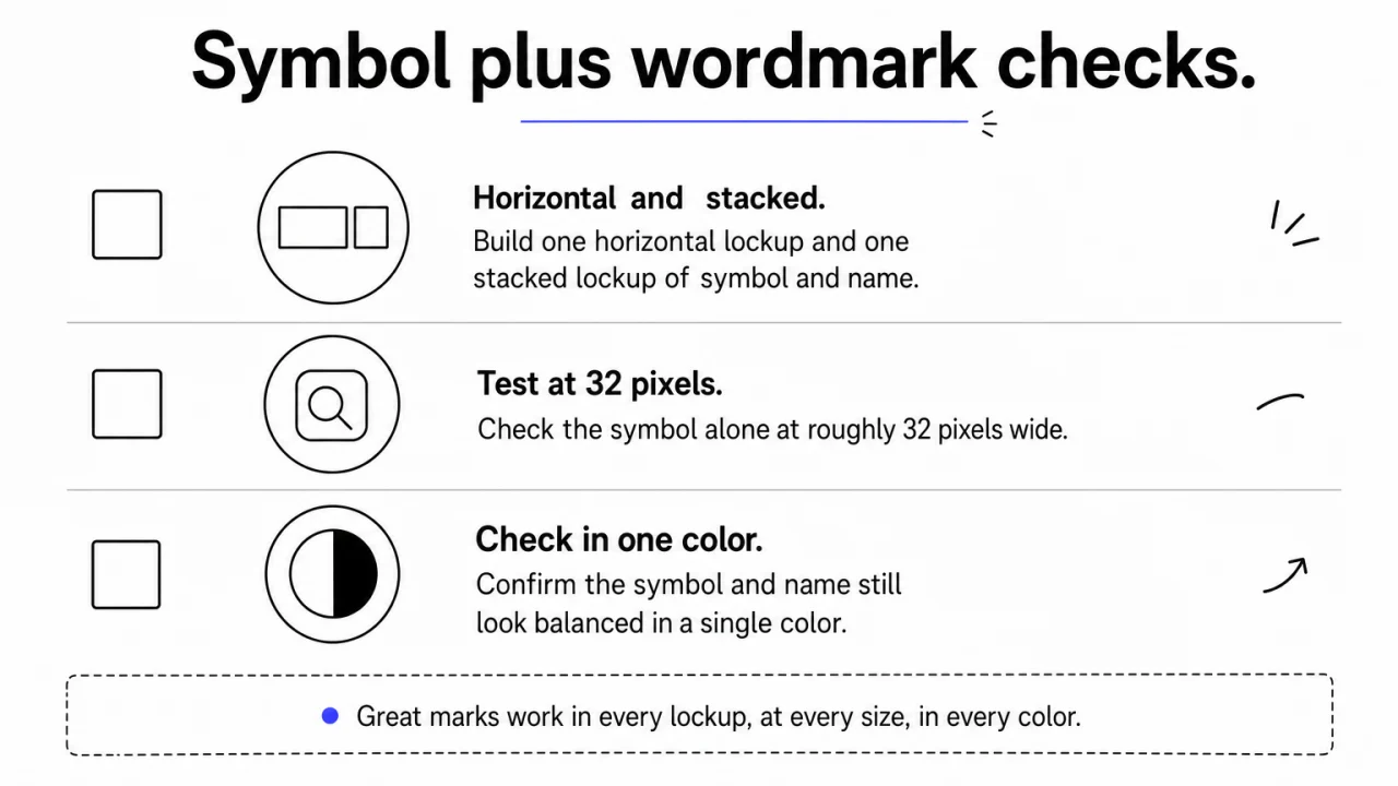
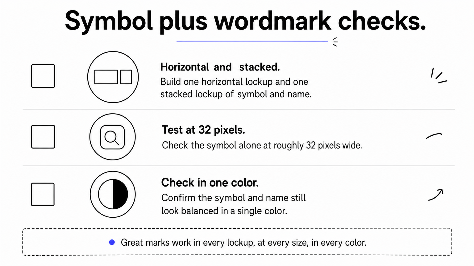
Pay attention to the whole name. A typeface that looks good in one large capital letter may become awkward across a long restaurant name. Ask to see a horizontal version for the sign and a stacked arrangement for narrower spaces.
Try the lettering on a plain menu cover before adding photographs or textures. If the name becomes hard to read when those extras disappear, it needs more work.
An emblem for a contained, repeatable mark
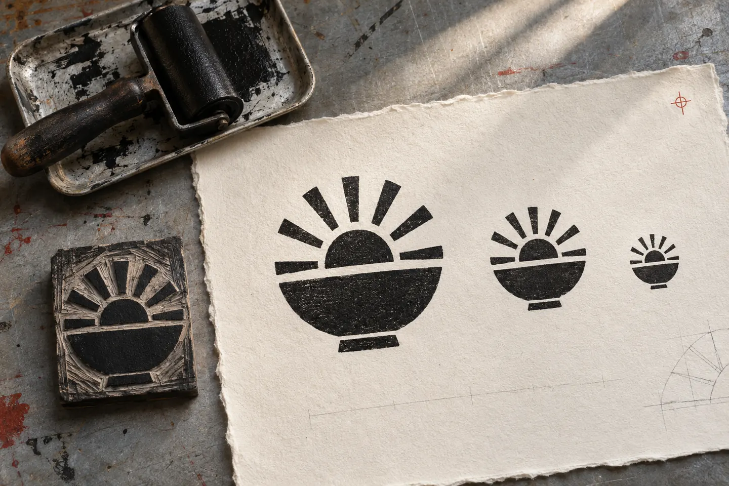
An emblem brings the name and supporting artwork into a defined shape. That could be a circle, an oval or a form drawn specifically for the restaurant. It can be a useful option when the identity needs a compact mark for packaging seals, labels or staff clothing.
The challenge is deciding what belongs inside it. A name, descriptor, illustration and several lines of small type can become crowded. Try removing secondary information until the name has enough room.
Ask the designer for a simplified version as well as the full emblem. Compare both at the intended size of your smallest label, then check a physical proof with the supplier before ordering.
A mascot with a role beyond the logo
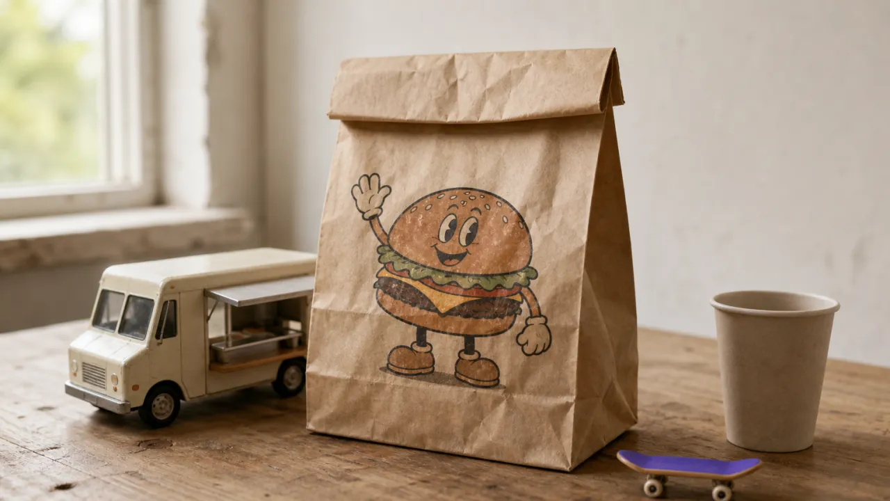
A character can give a casual restaurant a visual voice that carries into menus, packaging and social posts. It works best when there is a reason for the character to exist: a connection to the name, the food or a specific part of the restaurant's story.
Think about how you will use it after launch. Will the character point to a special on a menu, appear on a box or change pose for a campaign? Discuss those uses during the brief so you know which drawings are included.
Keep a readable version of the restaurant name alongside the character. Review the smallest application too; a detailed illustration may need a simpler companion mark.
A symbol paired with the restaurant name
A separate symbol and wordmark give you options for different shapes of space. The full name can introduce the restaurant on signage, while a compact symbol can appear on a packaging seal or profile image.
The relationship between them matters. Ask to see the symbol beside the name, above it and on its own. A mark that looks balanced in one arrangement may need a different scale in another.
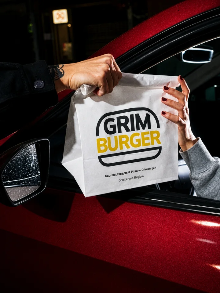
Grim Burger is a DBS portfolio example of carrying a clear visual idea across applications. Its name sits between bun shapes, with black, white and yellow used across packaging, signage and staff apparel. The case study lets you compare the identity on several surfaces instead of judging only a standalone logo.
Sources: Grim Burger restaurant identity
A monogram with a clear full-name version
A monogram uses an initial or a small group of letters. It can be useful for a long name or a compact application such as a stamp. Whether it feels formal, playful or understated depends on the letterforms and the rest of the identity.
The tradeoff is recognition. Someone discovering the restaurant may not know what the initials stand for. Keep the full name visible where people are choosing where to eat, including your menu, website and main sign.
Check the spacing and the spaces inside the letters at a small size. Ask for light and dark versions so the mark remains usable on the backgrounds you have chosen.
Compare the ideas on the same real materials
Put each shortlisted design on the same set of applications. This makes the review more useful: you can compare how each direction handles the menu, the bag and the sign without being distracted by a different presentation.
The Time for Sushi portfolio shows how a white wordmark on an orange menu cover connects to the inside layouts. The interior also has to accommodate dish photography, German listings, prices and allergen information. That is the kind of context a logo presentation should account for.
The actual name and menu
Use your final restaurant name and a representative menu page. Check that the identity leaves enough room for the information a guest needs.
The smallest screen use
Preview the mark at its intended display size. If the service uses a circle or square image, keep the artwork inside that visible area and inspect the result on a phone.
One-color reproduction
Ask for a single-color version and show it to the supplier who will produce your stamp, label or uniform. Let the production method determine which details need simplifying.
The sign and takeaway pack
Use the real proportions and background materials. For printed work, review a proof; for signage, agree how lettering, lighting and fabrication will be checked before production.
Watch Chris Do explain simplicity and recognition, then return to your own small-size and distance tests.
Video: The Best Logos Ever Designed Are Simple Not Interesting & Not Overworked by The Futur. Creator’s notes.
The YouTube player connects only when you press play. You can also use the video link above.
Try it with your project
Your selections stay on this page until you leave or refresh. Copy them to keep a record.
Sources: Time for Sushi menu design
What to agree before the final handoff
Write down the applications you need and ask which versions and files the project includes. A useful handoff may include editable vector artwork, screen-ready exports, light and dark versions, a one-color mark and guidance on spacing and minimum size. Agree the formats with the people who will use them.
Keep your approved name, menu copy and supplier requirements in one place. If the restaurant will use more than one language, provide the confirmed spellings and layouts early. Ask for those versions to be reviewed together.
For a project that includes bags, wrappers or labels, our food packaging brief guide explains how to gather formats, approved copy and printer templates. The food branding service page shows the wider scope available.
Sources: Food packaging design brief checklist · Food branding and packaging design
Questions to settle before choosing a restaurant logo
Does the logo need to show the food?
It can, if the reference supports a distinctive idea. Start with what people need to recognise about the restaurant, then compare a food-based direction with a lettering-based one.
Can a template or AI image help with the brief?
It can help you communicate a mood or explore a rough idea. Have a designer assess the final lettering, consistency and production files before using the result across your restaurant.
How do we decide between two strong options?
Agree the criteria before the review: readability, fit with the concept, use on the required materials and room for future applications. Record the reason for the choice so later changes have a reference point.
Your next step
Bring your restaurant concept.
Tell us what you serve, who you want to attract and which menus, signs or packaging you need. We can discuss the identity and the formats it should cover.
Let's talkWhat happened when you tried?
Which use is hardest for your restaurant logo: the sign, the menu or a small screen? Tell us what you are trying to make work.
Share your feedback
Email us directly at hello@designerbstudio.com.
Replies go to our inbox; they are not posted publicly. Please leave out verification codes and identity documents.